
Is that ok? :( If it isn't, then I gotta painful-eyed one ta show ya. :P


Full-Fledged Hamster


Posted 10 February 2007 - 08:50 AM
Veteran Hamster


Posted 10 February 2007 - 09:06 AM
Veteran Hamster


Posted 10 February 2007 - 11:22 AM

Edited by Maremoto, 10 February 2007 - 06:19 PM.
Veteran Hamster
Posted 10 February 2007 - 11:32 AM
Edited by zirbo, 10 February 2007 - 11:35 AM.
Full-Fledged Hamster
Posted 10 February 2007 - 12:15 PM
http://www.strangeangels.net/index.html Go there and click "note", scroll down and it will tell you how to install them.
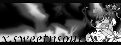
Well Ami, you gotta take into account the things we explained. The colors you picked don't really flow together, and the picture is rather dark. It is a good for a first try though, I'll give you that. If you're having serious doubts about your own creation, think about what you see wrong. If you know it doesn't look right, try something else. Remember, don't use text effects if it dosn't really match. Stick with white text and black border. I recommend downloading the brushes I told zirbo to get, download them here http://www.strangeangels.net/index.html It'll will help you with your backgrounds. Looking forward to your next attempt
 I'll see what I can do about the brushes.
Veteran Hamster


Posted 11 February 2007 - 01:38 AM


Edited by ilovescooter1, 11 February 2007 - 03:31 AM.
Veteran Hamster
Posted 11 February 2007 - 03:51 AM

Edited by Maremoto, 11 February 2007 - 03:54 AM.
Junior Hamster


Posted 11 February 2007 - 05:14 AM

Edited by Sooty's Mum, 11 February 2007 - 05:15 AM.
Veteran Hamster
Posted 11 February 2007 - 08:19 AM

Full-Fledged Hamster
Posted 11 February 2007 - 08:51 AM
 I go on GT, and they said I've been improving. I'll go from my earliest to latest, earliest first.


Hamster Clone


Posted 11 February 2007 - 09:28 AM
Veteran Hamster
Posted 11 February 2007 - 10:09 AM
Hamster Clone
Posted 11 February 2007 - 11:09 AM
im not sure on exactly how to his on PS., perhaps maremoto knows.
Edited by HammyGranny, 11 February 2007 - 11:16 AM.
Angelic Ham


Posted 11 February 2007 - 02:14 PM
Full-Fledged Hamster
Posted 11 February 2007 - 04:56 PM
To Sooty:
NOt too bad honestly. I would stay away from light filter and 'rainbow rings' they look unprofessional. U have a good sense of flow. Kepp trying , and a few tutorials wouldnt hurt.
to Zirbo:
Very Good! Much better! Try feathering the egdes of your render, and using a white text, but better! keep practicing
to ami:
the Members on GT have given you good advice my biggest tip is STILL, do not overdo text. Text should be samll and not attract much attention. keep trying


